No digital marketing campaign is complete without the foundation; a website. Websites not only contain tons of information about a company but also serve as a digital branding pamphlet, and a great connector of all other digital collateral across the web. When it comes to web design, companies are tasked with the challenge of creating memorable websites that adhere to brand identity, filling their pages with relevant content, creating keyword rich metadata to rank in search engines, and answering the question, “What do we want people to do when they visit our website?”
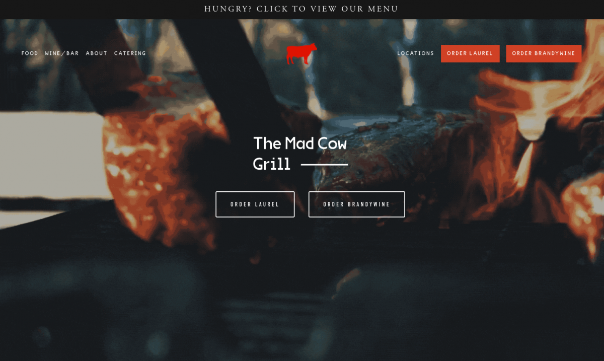
You can see our use of optimized user experience and Calls to Action (CTAs) for our client Mad Cow Grill in the screenshot above.
Conversion Goals
For most companies these conversion goals might seem obvious, but you may be surprised at how many there are. Let’s take a look at some of the most popular ones:
Clicks to Call
A clickable telephone number, or a button that says “Call Now.”
Clicks to Email
A clickable email link, or a button that says “Get in Touch” or “Contact Us.”
Form Submissions
A link that takes users to a page where they fill out a contact form with basic input fields like: Name, Email, Phone Number and Message.
Online Ordering / Shop Now
For companies that have sales channels, like online ordering (restaurants) or e-commerce shopping carts, directing users to be able to make these purchases.
Get Directions
A link that takes users to a Google Maps listing so they can find their way to a storefront.
Conversion Tactics
Now that we’ve established some common website goals, it is important that we make it obvious for users to achieve these goals. Factors that make these goals obvious are things like: placement, design, language, and functionality. Is our most important goal showing on the web page at all times? Do our important links look like links, or even better, buttons? Is our language descriptive and letting users know what they’re being directed to do? Do our goals work the way that they should be, with the least amount of clicks? Taking these things into account, let’s explore these 5 tactics that will help users convert once they get to your website:
1. Create Above the Fold CTA’s
There are two key terms to get familiar with here: Above the Fold, is anything that you initially see in your browser window without having to scroll down, and CTA is a Call to Action. Imagine a website that has a large image with no text. It looks great but there is no directive and it relies on the user’s intuition to scroll down. A better idea is to have some text overlaid on the image, and a bright button that says “Contact Us,” this is now the first thing the user sees and is a very obvious actionable item.
2. Define User Flows
The most common user flow is to read a heading, read a paragraph, and then follow a suggested call to action. However, if we do not make it clear for the user that there is an action item after reading a paragraph, they will either keep scrolling or exit the site, and we have missed an opportunity for a conversion. Consider auditing your site for large paragraphs that discuss a service and then add a noticeable button after, to “Get Started” or “Call Now”.
3. Add a Button to the Navigation – Then Make it Sticky!
The navigation is the most essential tool for a user to explore the website. Intuitively, users will go there immediately to find links to specific pages like: About, Services, and Contact. If your site is laid out traditionally, with a branded logo in the top left corner and navigation in the top right corner, we should make our CTA last and look a little different than the rest of the navigation. This creates an obvious opportunity for more conversions, and lets users know where you want them to go. To make this CTA even more obvious, we can keep the logo and navigation fixed to the top of the screen when users scroll down so that it is “sticky.”
4. Utilize Contact Info in the Header and Footer
In most cases, users will want to contact you – whether it is a call, email, or directions. We like to keep this information accessible. The two places to accomplish this are in the header and footer of the website. The header refers to the very top of the website which usually contains a logo and navigation. In some cases we can fit a thin bar above that section that includes a clickable phone number, email link and address that leads to a Google Maps location page. The footer is the section that appears on the bottom of every web page. This can be stylized to include the same clickable contact information and even social media icons to entice users to follow your brand.
5. Create a Mobile Action Button
Today a vast majority of website users are using mobile devices as opposed to desktop devices. Therefore it’s important for us to consider the design of our website as mobile-first. Websites that are designed for both desktop and mobile screens are called “responsive” because they respond to different screen sizes with an adaptive design. In the mobile layout of any site, we should consider adding a sticky, or fixed, CTA button to the bottom of our screen so that it is persistent and users can always access that CTA button.
I hope this article has helped to empower you to take control of your website design and drive more conversions. If you have questions about the best way to optimize your website for conversions please contact someone from Hudson Creative today and one of our experts will be happy to help.
